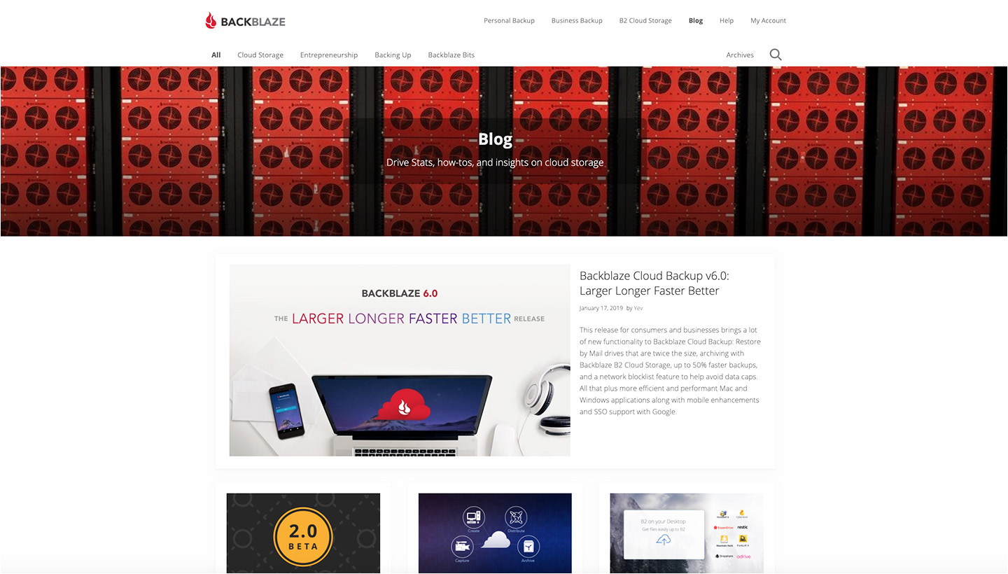
As we recently teased, we’ve been working on a new blog design and now it’s here. We invite you to kick the tires, take it for a spin, do a few donuts, and tell us what you think.
Our goals for the new design were pretty simple:
- Present a friendlier user interface
- Make it easier for the reader to find content related to what they’re reading
- Introduce the reader to content they might not know we wrote about
- Make everything work faster
Specifically, here’s what’s changed:
- Overall — Faster, easier to navigate, more content to discover
- – Faster to load
- – Highly responsive for mobile visitors
- – Worldwide Cloudflare caching
- – Three-column, responsive, grid layout
- – Smooth scroll back to top of page
- New Home Page layout — A better introduction to the blog
- – New banner for desktop visitors
- – Mission statement
- – Featured post(s) at the top of the page
- – Editor’s Pick post(s) at the beginning of the blog roll
- Category Pages — More information on categories
- – Optional featured post from that category at the top of the page
- – Category description at the top of the page
- Tag Pages — More information on tags
- – Tag description is at the top of the page
- Author Pages — Who is the author?
- – Author bio is at top
- – Author’s past posts
- Post Pages — More information about the content you’re reading
- – Wider post text area
- – New sidebar highlights posts related to the post being read
- – Option to include other content & events related to the current post
- – Option to print post, if desired
- Archives Page — A new way to discover content
- Discover posts by:
- – Date
- – Category
- – Tag
- – Search
- – Byline
- Discover posts by:
Our new blog is faster and more flexible so that we can change or add capabilities as we need them. We already have a few more items we’re planning to implement over the coming months.
Please tell us what you think of the new design and if you have any other enhancements you’d like to see.


