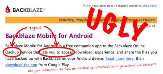
Our customer newsletter email for August was “Major Ugly.”
We’re sorry.
Let me explain.
About once a month, the marketing folks at Backblaze send out a newsletter via email to our customers. These emails are sent conforming to our customer privacy policy and terms of service. Only customers (not trial users) receive the newsletter and a customer can unsubscribe any time. We work hard to follow the rules as several of us at Backblaze came from an anti-spam company (MailFrontier) and we hate email spam as much as you do.
We send out the newsletter to let our customers know what’s going on at Backblaze. Most of the time, the articles refer back to recent blog posts on popular topics like drive stats, product releases, and Storage Pods. In addition, we provide Backblaze tips and tricks, customer stories, and thoughts on industry trends. We strive to ensure the newsletter is helpful without having too much marketing (although there is some), and we try to keep it short.
This past month we changed our email distribution company to MailChimp. This meant we had to create/recreate our entire process around sending out the customer newsletter emails. There are new lists, new forms, new templates, and so on, to create. It’s a lot of work.
In the meantime, there were several large projects coming to fruition; our engineering group was finishing up the Android app, the Backblaze website was undergoing a major new look, and our website was switched over to HTTPS. What was common to all of these projects was the need for quality web design and graphics. When combined with all the other normal tasks, our design team was stretched thin. On top of that, it was summer and long planned vacations were waiting.
The email marketing team decided to send out the August customer newsletter on the same day Backblaze Mobile for Android was announced. There was great interest in the Backblaze Mobile for Android app and the newsletter is a quick and efficient way to reach our customers. There was only one problem: the Backblaze design team was maxed out. So our email marketing folks decided they could design and build the new templates needed for the customer newsletter—graphics and all. That appears to have been a less than stellar decision. Here’s a couple of quotes we got from the August email recipients…
“If you outsource your newsletters, that’s a lot of typo action.”—Chris
“This email looks so junky, I didn’t think it was from Backblaze. Look at your website, backblaze.com and then look at this email. Yikes!”—Jeremy
…and so it went. It was not one of our finer moments.
Lessons Learned
- Just because you can write HTML code, doesn’t mean you can design an HTML email.
- Have someone else proofread your stuff, not just other marketing folks.
- Your website style and your email style need to match—in other words, read the style guide.
- A graphic used correctly is worth 1,000 words. A graphic used incorrectly is worth one word: ugly.
It wasn’t all bad, some folks got past the ugliness and said some nice things:
“Backblaze for mobile Android! Yay! Been waiting so long for this.”—Moj
“I love the fact that you do these frequent updates! Thanks.”—Jere
Thanks Jere, and thank you to everyone who shared their opinion. Expect that our September customer newsletter will have fewer typos, better grammar, and be less “UGLY.” That last point of course relies on the assumption that our design team has finally stopped laughing at the August newsletter.


